
Sergey Nivens - Fotolia
Amazon QuickSight tutorial: Get started with data analysis
While Amazon QuickSight comes with some tradeoffs that data scientists should note, this tutorial walks you through key features that might be of interest to your analytics team.

When it comes to data analytics, some AWS tools might not fit the bill.
Amazon QuickSight is a good example. The service is similar to Excel or Google Sheets, but it's not a particularly powerful big data analytics tool. QuickSight lets you create pivot tables -- which are similar to views -- but it only has a limited set of functions. And you can't write your own functions in a scripting language, as you can with Microsoft and Google.
But QuickSight does let you work with lots of data formats, such as Salesforce or Apache Spark, and large enterprise data sets. And as evidenced by the Amazon QuickSight tutorial below, the service has some nice features that allow business analysts and others in your organization to access databases and ERP data.
Since QuickSight runs on the AWS cloud, you can work with large data sets without storage or memory issues. You can also create a series of tables and graphs and save them as a slideshow to show in a presentation.
Follow along with this short Amazon QuickSight tutorial.
A step-by-step look at QuickSight
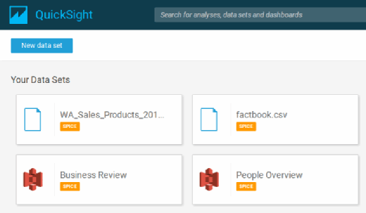
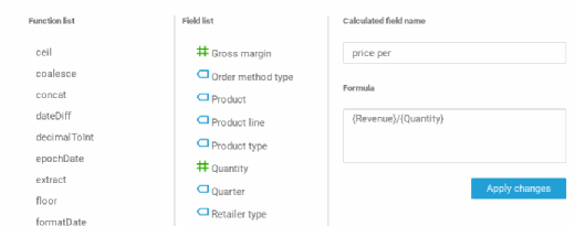
1. Click New Analysis in the QuickSight dashboard, and define what kind of data to import. During this stage, you can also create calculated fields.
For example, you could evaluate a company's quarterly sales. If the company does not list each sales transaction, you can take the revenue for a product and divide it by the quantity sold to calculate the average price.
2. After you import or connect data sources to the service, create a table where you can list and visualize data. This process helps you determine what kind of report or calculation to wrap around the data.
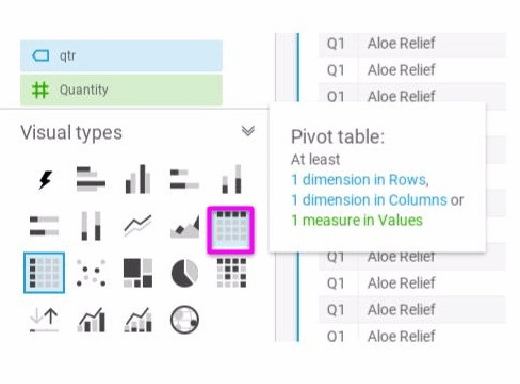
3. After you create an analysis, click this icon to create a visual table:
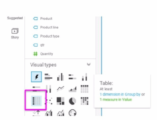
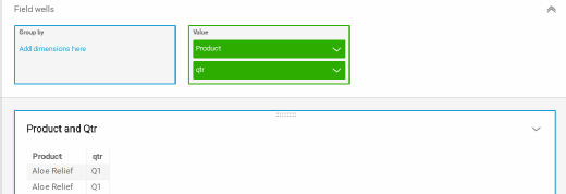
And then drag fields to the field wells on the right:
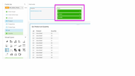
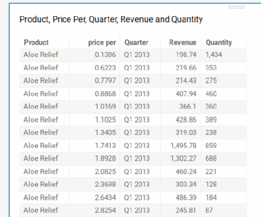
Toggle between the graph or table elements and the output itself, based on what you want to show your audience during a presentation or in a report.
4. Then, click Capture to add it to a slideshow. Click the Pivot table icon to create tables where you can sum, count or average values.
5. Drag fields onto the pallet, and select the function you want. You can put the field name in curly braces {}, then type operators, such as / and *. The editor is not helpful with syntax errors; it will just report an error with the saving function.
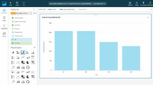
In the example above, we can create a calculated field called qtr and add the field to a pivot table. This one shows sales data by quarter across all the years in the data, determining which quarter has been busiest over time.
You can create calculated data fields in either the visual or the data management view for current or long-term analysis, respectively. If you calculate fields in the data management view, that information is available for all reports and charts. Click the QuickSight Icon on the top left, and then select the Manage Data button.
In the final step of this Amazon QuickSight tutorial, we can turn the pivot table above into a bar chart by clicking the bar chart icon. That creates a chart like this:
Excel and Google Sheets analysts will love this tool, even if they find that some statistical and financial analysis functions are absent from QuickSight. But they can connect to Salesforce and other systems directly for ad-hoc analysis; IT doesn't need to forge those integrations.
Data analysts are limited only by their creativity. For example, they can always write statistical and financial analysis functions themselves -- just not in a scripting language. While not covered in detail in this Amazon QuickSight tutorial, you can calculate the variance manually, then take the square root of that to find the standard deviation. But QuickSight has no linear regression feature or anything similar to that. You can build up complex calculations in steps by creating pivot tables, such as CSV files, and then import them into another analysis and repeat the process, thus running an algorithm.